Painting Pixels
DEC 20 2023 :: PHIL GERITY
Credit: Sibyl Sanford
At first glance, watercolor painting and product management seem worlds apart. But as a product maker with a passion for technology who happens to have a mother who is a skilled watercolorist, I've discovered fascinating parallels between these two fields. It turns out that the same principles that attract us to art can provide unexpected insights and guidance in creating compelling digital products.
1. Core Values
Key idea: establishing core values ensures every feature and update aligns with the product's ultimate purpose.
In art, core values refer to the underlying themes and emotions that a piece is meant to convey. Similarly, in product management, core values define the product's purpose and direction. Just as a painting without a clear vision can seem disjointed, a product lacking solid core values may fail to resonate with its audience.
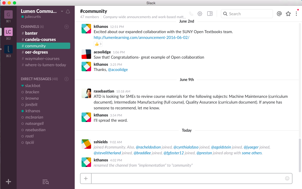
Slack is a workplace collaboration tool which enables teams to streamline communication and collaboration. Its main value proposition is to replace email with a more flexible, instant messaging system that integrates with various productivity tools and services. Slack offers organized channels for different topics, private groups, and direct messaging, along with features like file sharing, notifications, and the ability to search through all messages and files for efficient information retrieval. This focus on improving team communication and collaboration has made it popular for businesses and teams, thanks to its strong core value proposition.
2. Illuminating the User's Path
Key idea: a well-crafted product ushers users effortlessly towards their desired outcome, optimizing user experience and providing a smooth navigation through the application.
Artists use light to guide the viewer's eye through a painting, to draw the viewer to a focal point. In product design, this principle translates into creating intuitive user flows. Just as light in a painting creates a path for the eye to follow, a well-designed product guides users effortlessly to their destination, enhancing user experience and ensuring a seamless journey through the application. ideally this takes the form of good user flows, but can be augmented by easy paths back a landing page or the beginning of a task. In-product tips and tricks can also help users find where to go next.
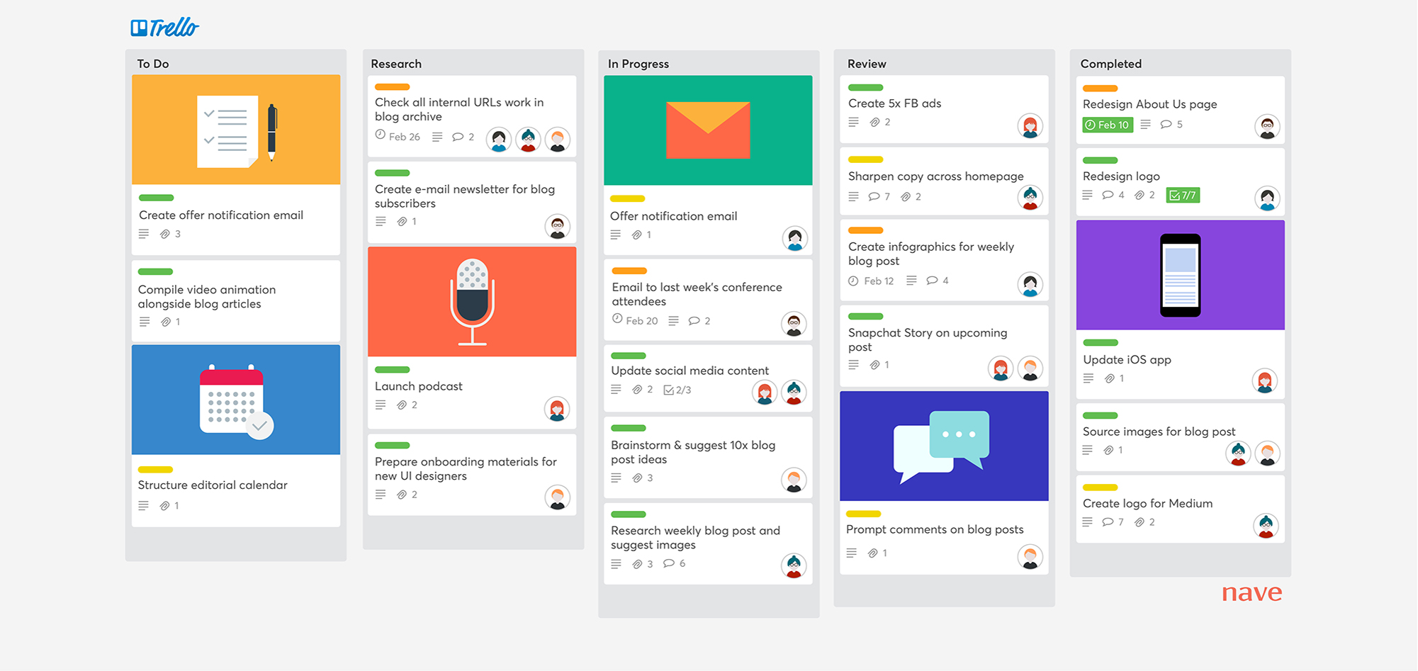
A digital product with a well-organized user interface is Trello, which uses an organized, card-based interface that makes it visually intuitive for users to see their tasks and progress. Each card represents a task, and these cards can be moved across different columns or lists, which can represent stages of a project or different types of activities.
3. Consistency in the User Experience
Key idea: maintaining consistency in design elements renders the product more instinctive and visually appealing, thereby boosting overall user satisfaction.
A consistent color palette in watercolor painting creates a sense of harmony and balance. In digital products, a consistent design language, including colors, fonts, and layouts, provides a similar sense of coherence. This consistency in design elements makes the product more intuitive and aesthetically pleasing, enhancing user satisfaction.
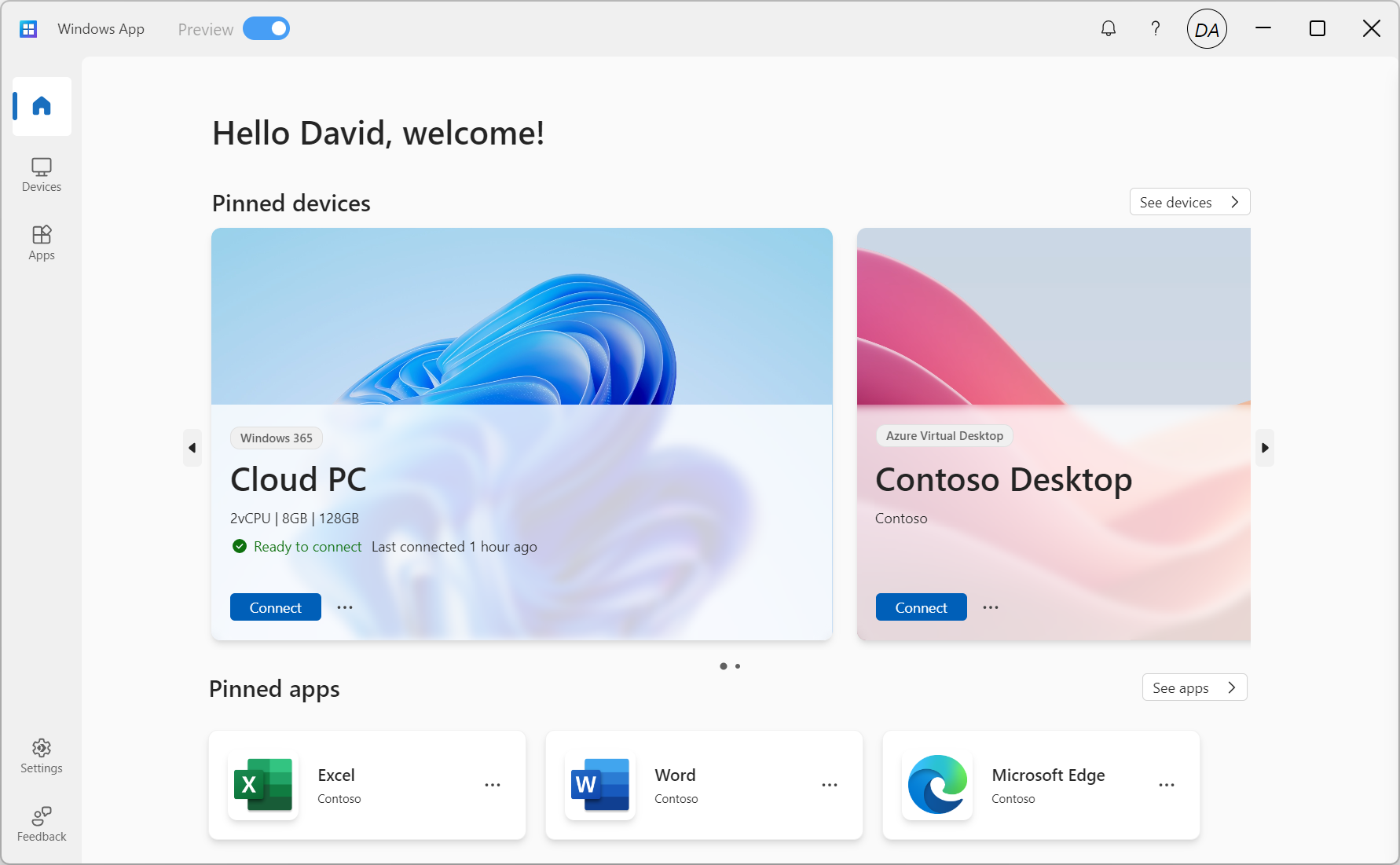
Recently, my team at Microsoft released the "Windows" app for Windows 365, Azure Virtual Desktop, Remote Desktop Services, and Remote Desktop. You can find this app on every platform with a consistent user experience that makes our users and customers more productive.
4. Setting the Emotional Tone
Key idea: emotional tone should be consistent throughout to ensure a unified user experience.
Artists often choose between a dominantly warm or cool palette to set the mood of their artwork. In digital products, the 'temperature' can be seen as the overall mood or tone of the product. Is it professional and efficient, or friendly and inviting? This emotional tone should be consistent throughout the product to create a cohesive user experience. Again, having an identity is crucial for any successful product and then weave in everywhere you can.
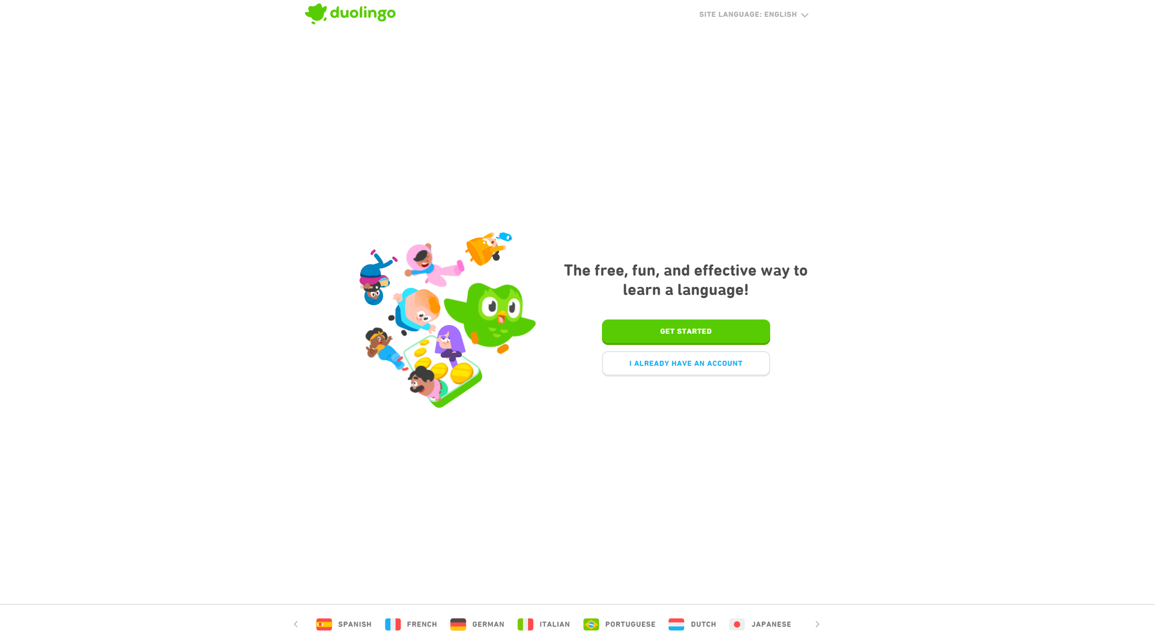
A product that effectively demonstrates a strong identity and integrates it seamlessly into the user experience is "Duolingo." Duolingo's identity is centered around making language learning accessible, fun, and engaging. This is reflected in its playful, colorful interface and the use of game-like elements such as points, levels, and rewards to motivate users. The friendly, approachable tone is consistent throughout the app, from its character animations to its encouraging feedback and lighthearted notifications. This integration of a fun, engaging atmosphere with educational content reinforces Duolingo's identity as a user-friendly platform for language learning, making the process enjoyable and effective.
5. Engaging Users with Mystery
Key idea: an exceptional product should be simple enough to be user-friendly while also offering hidden layers that users can delve into, holding their interest and captivating them.
In art, 'lost and found edges' refer to areas where the painting fades into the background, creating intrigue and depth. In product design, this can be seen as the balance between simplicity and complexity. A great product should be simple enough to be approachable but also have hidden depths that users can explore, keeping them engaged and interested. Humans are inherently playful. We are smart, so we don't like boring.
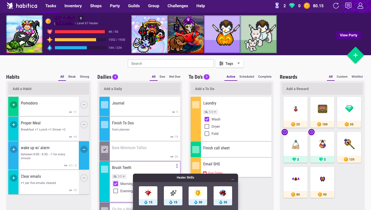
A productivity app that engages users by gradually revealing features, is "Habitica." Habitica gamifies your daily tasks and habits, turning them into challenges in an RPG-like (Role-Playing Game) setting. The mysterious element is prominent as users unlock new features, rewards, and levels progressively as they complete tasks in real life.
6. Connecting Everything
Key idea: synergy is vital in delivering a fluid, unified user experience, where each feature complements the others organically.
Just as a watercolorist connects different elements in a painting to create a unified whole, a product manager must ensure that all aspects of the product work seamlessly together. This integration is crucial for providing a smooth, cohesive user experience, where each feature naturally complements the others.
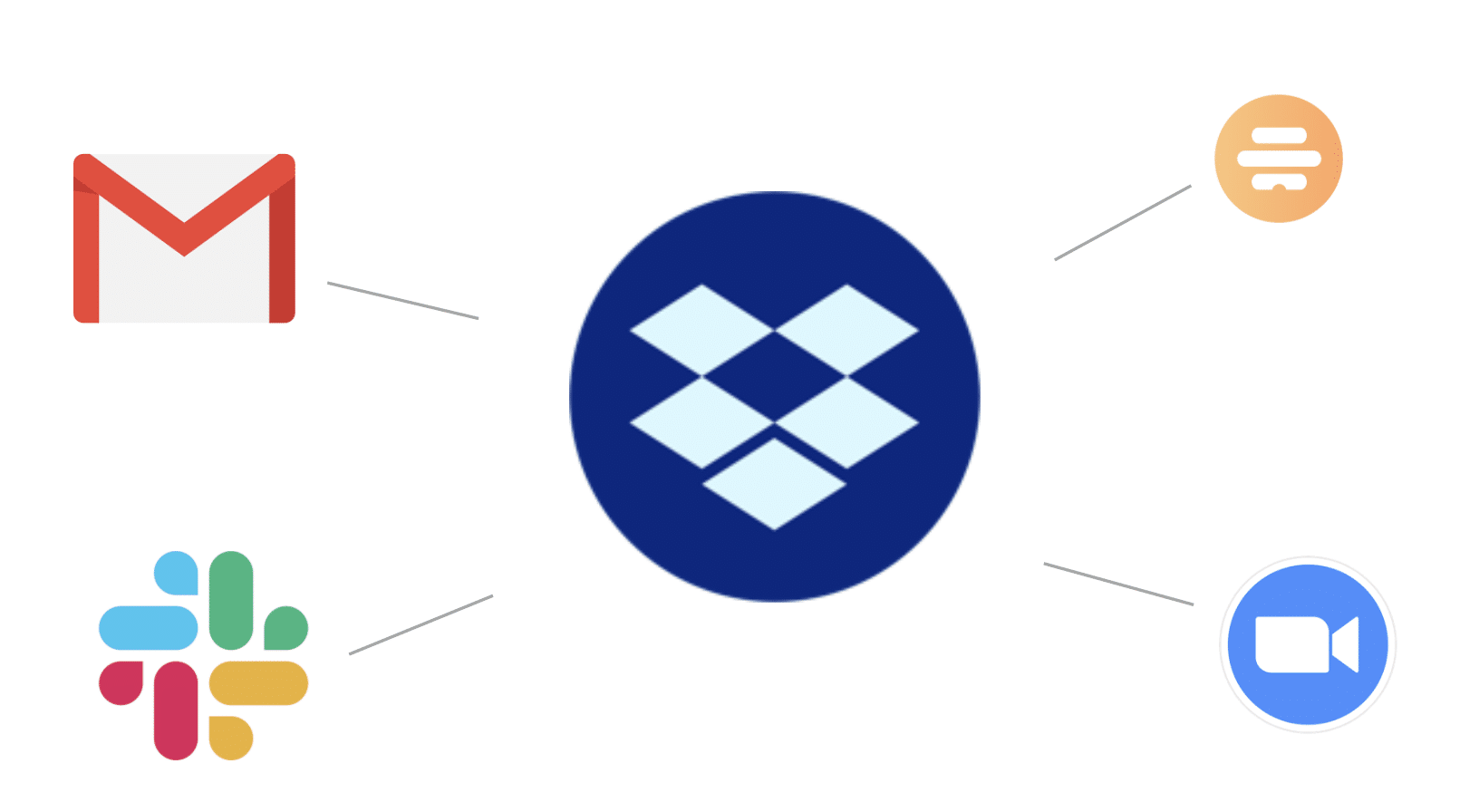
Many apps, like Dropbox, rely heavily on their integrations with other apps and services to provide effective value to their users. While Dropbox is an obvious example across products it is just as applicable between features within a product.
7. Maintaining Interest
Key idea: maintain user engagement by creating satisfying milestones and goals for users as they complete tasks and make progress.
In art, varying shapes keep the composition dynamic and engaging. In the digital realm, keeping users engaged is crucial to success. Varying interaction modalities from sound to visual cues to gamification can keep things interesting and boost engagement.
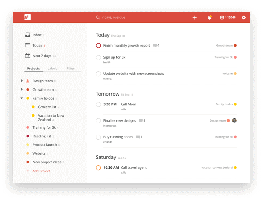
A productivity app known for its high engagement rates is "Todoist." Todoist is a task management and to-do list app that is highly regarded for its simplicity, effectiveness, and user-friendly interface. Users can set up projects, delegate tasks, set priorities, and get reminders, making it a comprehensive tool for personal and professional productivity. The app's design encourages regular interaction and frequent check-ins, uses satisfying sounds to signify task completion, and "karma" scoring of how productive users are, to keep engagement rates high.
8. Maintaining Focus
Key idea: emphasize core focus (positive) while also being cognizant of what to exclude or downplay (negative).
In watercolor, positive painting involves directly painting the subject, while negative painting is about painting around the subject. For product managers, this principle can be applied by focusing on core functionalities (positive) while also considering what to omit or de-emphasize (negative).
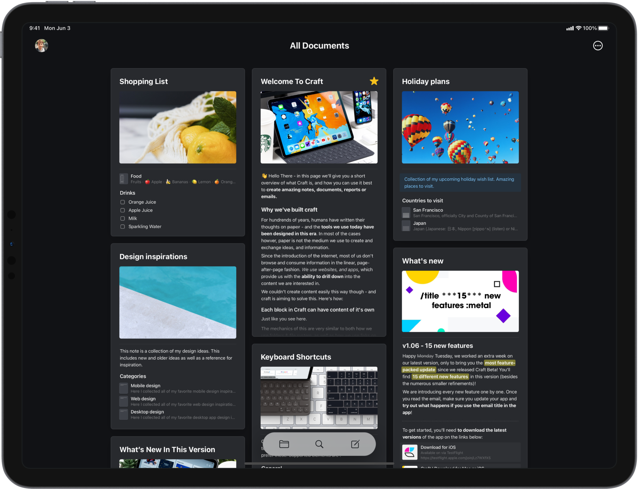
The "Craft" app maintains a strong focus on its core capability: seamless and intuitive document creation and organization. It achieves this by offering a clean, user-friendly interface combined with powerful features, such as embedding media and linking between documents, without overcomplicating the user experience. This approach ensures that users can efficiently manage and create content, while the app remains true to its primary function of being a straightforward, yet versatile, digital writing tool.
The principles of watercolor painting offer a unique lens through which to view digital products. By applying these artistic concepts, we can create software that is not only functional but also resonates on an emotional and aesthetic level with our users.
Products we care about are products that help us do things and experience things better than before. We often look to user engagement with these products as a measure of success. And user engagement is rooted in the same psychology that governs the artistic principles described here.
Maybe it’s worth learning those principles just in case they make some of our decisions easier. Or as Pablo Picaso once famously put it,
"Learn the rules like a pro, so you can break them like an artist."
Originally published on Product Byte (Substack)